
You’ve probably heard the term Responsive Web Design numerous times. And you probably know that you need a responsive website. But when it comes down to it, do you actually know what a responsive website is?
We’re going to break it down for you below.
WHAT IS RESPONSIVE WEB DESIGN?
No matter if you’re a business owner or website professional, responsive web design can be a confusing concept at first. Have you ever visited a website on your phone and nothing resized to fit your device, causing you to have to move the page around and pinch & zoom to view the page? Then you landed on a website that was NOT responsive. And that creates a frustrating experience right?
At its most basic level, a responsive website “responds” to the size of the screen you are viewing it on. To really understand how responsive web design works, take your mouse when you’re on your desktop or laptop and drag the far right edge of your browser window over to make the width smaller and larger again.
Font sizes, images and the placement of elements on the page should adjust fluidly and seamlessly based on the device’s screen size. And with so many different devices, there are a number of considerations to be made when thinking about a responsive website.
When viewing on a widescreen monitor, a full-width banner image on a website may look very large and you may have to scroll down before viewing any additional content, however, if you view the same banner image on your phone you may see a smaller image and more content below before you have to scroll down the page.
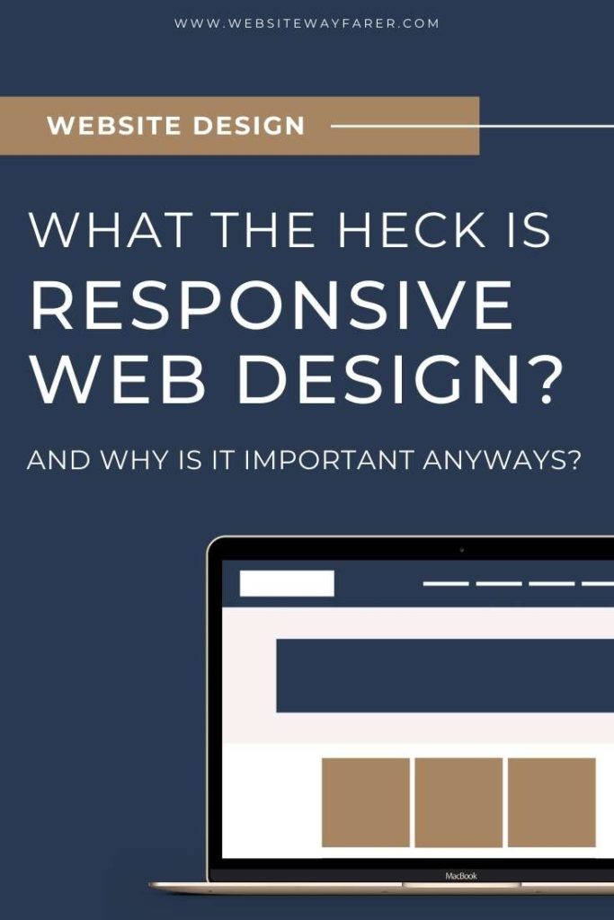
To show the concept, take a look at the images below. In general, a website is made up of a basic grid. And as the screen gets smaller, those grid elements will need to stack on top of each other and resize to accommodate the smaller size.
On a desktop, a navigation menu may have each menu item spelled out across the screen while on a mobile device, you’ll typically see these items condensed into a “hamburger” menu that expands out when you tap on it.


WHY IS RESPONSIVE WEB DESIGN IMPORTANT?
With mobile device viewers accounting for well over 50% of website traffic, responsive website design is one of the most important considerations when thinking about your website. Your customer or visitor should get the best possible viewing experience no matter what device they may be using to interact with your website. Users want to view sites just as quickly and easily on their mobile devices as they do on their desktops.
More importantly, Google takes into account whether or not your website is optimized for mobile viewing and factors that into your search rankings. So without a responsive website, you risk your website displaying below your competitors in the search results that are mobile-friendly.
Mobile website traffic will continue to climb so it’s imperative for your business to offer the best possible mobile experience to your customers. Your mobile experience shouldn’t be an afterthought but rather the first consideration in a website design process.
With responsive websites being the industry standard, be sure to take the time to ensure your website design is providing the best user experience across all devices.


